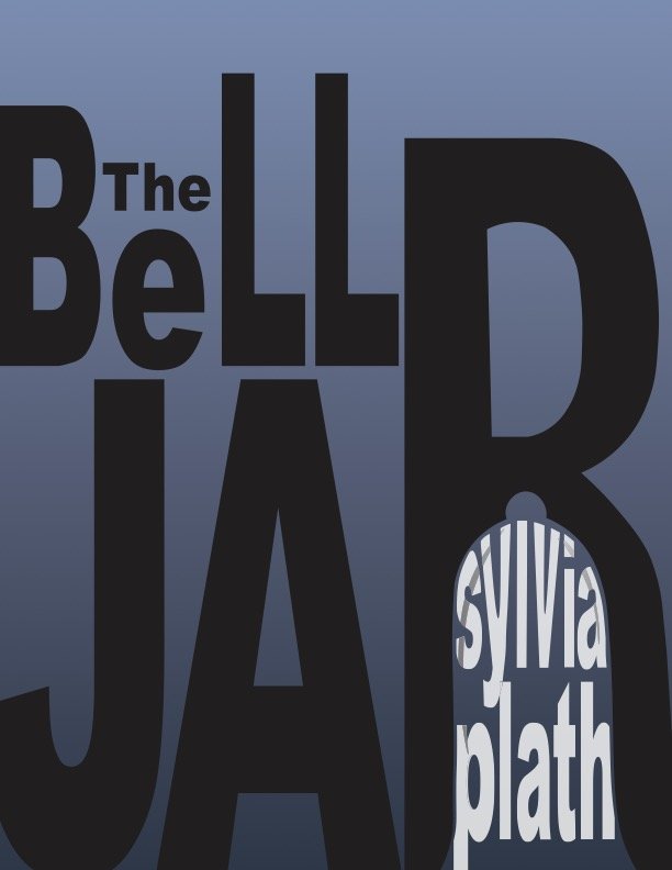
This was a typography project based off of the novel “The Bell Jar” by Sylvia Plath. The specs of the project were to use strictly text to convey a meaning/feeling. The symbolism and choices behind the design are explained in further detail below.

The Bell Jar by Sylvia Plath
-Bold, dark, oppressive main text to symbolize how oppressed by the world the main character feels
-Bell jar element in the letter “R,” as well as the author’s name being trapped within the R to further illustrate how trapped/oppressed the main character character feels
-Dark blue gradient as a background to convey the main character’s depression (ie: “feeling blue”), as well as the recurrent themes of the ocean/feeling of drowning